
Sweet & Soft
Tuesday, February 8th, 2011
Layout using the kit Sweet & Soft from Nina Scrap Designs.
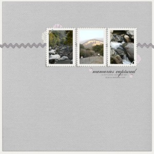
Layout using the kit Sweet & Soft from Nina Scrap Designs.


Layout using the kit Sweet & Soft from Nina Scrap Designs.


I got asked to join the Creative Team for Ninascraps Designs at Oscraps. I am very excited to get asked and to join this lovely team. Nina has a variety of wonderful products including her awesome “simple” templates. You can find her products and layout samples at Ninascraps Designs at O’Scraps.

I finished the digital scrapbook of our family vacation to San Simeon and Disneyland in November. Here’s the Shutterfly book of the trip:

This is the final week of the on-line class. No new information, but lots of encouragement to continue. The assignment from this week is to look at all the layouts that you’ve done for the class and choose your two favorites. Now, that those two layout sketches and do other pages with those same sketches. I have a few that I really enjoyed using – the ones dealing with white space in week #5 were some of my favorites. I also really liked week #8 when we did layouts with large photographs, especially when it is contrasted with smaller photographs. I love the visual impact.

The element for week #11 is type. Cathy emphasized the idea of only really needing a few fonts. Often the same font can be used for the journaling and the title. The act of making a font bigger for the title can be enough. Additionally using size contrast on a title can be enough as well.
In one layout, we used the same font for the journaling and title. I used Helvetica here.
In another layout, we contrasted the size of the type in the title.

Here’s the summary of last week:
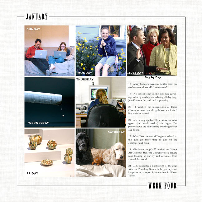
Denise Gormish: Template
Jesse Edwards: Clean and Serene Solids, designerdigitals
Ali Edwards: Day + Month Labels Brushes, designerdigitals

Layouts done: 13
I finished my gift project. It’s being printed by Shutterfly and now I am awaiting its arrival….

Partially done: 6 layouts
Completely done: 6 layouts

I have two weeks of class to finish, week #11 and #12. I have a basic sketch and idea for the layouts, but I have put them aside for now. I’m on a detour. Here’s why:
For Mike’s mom I made her a digital scrapbook for Christmas. It consisted on pages from our life January – June. It was not all the pages. That would have been about 100 pages. This was 25 selected pages. Well, her birthday is in February and it is my goal to give her a book with July – December done. Of coarse, I haven’t scrapped all those pages yet so I have to do some of those! I went through all my pictures and figured out which 12 (!) pages I need to do. So, I have about 3 weeks to do 12 pages. How am I doing? Well, I’ve got the photos on pages, titles and journaling done on all of them. Now, to tweak them with my wonderful Designer Digital products.
Partially done: 11 layouts
Completely done: 1 layout

I am SO catching up here!
In week #10 Cathy Z. took a look at the huge topic of color. We have been discussing color all along with various color combinations to try. This week, she discussed the basics of color theory but then shared her approach to color. She looks for 4 colors in her photographs that may work. She may narrow them down to 2 or 3 colors but then she looks for papers and embellishments in those colors. Next, she will work with the proportions.
We did a couple exercises of picking 4 colors from the photograph and then narrowing it down to 2 or 3 colors. I learned that I am really more comfortable with a two color plus neutral combination. I am addicted to white especially for the journaling and/or background colors. I did two layouts this way, but I won’t post the pictures because they are group shots.