Archive for the 'Scrapbooking' Category

h1

Design Your Life Week #9

Saturday, January 3rd, 2009

Week #9 of  class concentrated on the elements of LINE and SHAPE.

The placement of line (vertical, horizontal, etc.) can effect the feel of a layout. Lines also lead the eye on a layout as well as provide stability. Lines do not have to be physical but can be implied by the use of space.

Shape is the form of an object or a group of objects. Shapes effect the feel of the layout.

In the first layout, the obvious horizontal line and implied vertical lines provides unity and stability to the layout. The whole layout has a nice shape to it as well.

ddisneychristmasw.jpg

 Journaling: Even though we visited Disneyland before Thanksgiving, the holiday decorations were already up in full force. While it was pretty and festive, we decided we preferred the regular Disneyland look. Jennifer in particular was annoyed by the fact that holiday decorations were up before Thanksgiving. In the end it was nice to see the decorations but our next visit will be during a regular time of the year.

Jesse Edwards: Clean and Serene Solids and Anna Aspnes: MonoBlendz Confiture Paperie, designerdigitals.com

Font: Disney Print, Arial Black

Layout and concept provided by Cathy Zielske’s Design Your Life workshop at Big Picture Scrapbooking

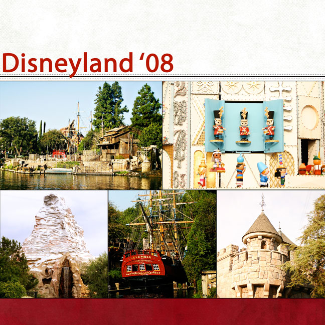
Here’s two-page layout concentrating on line:

ddisneyland1w.jpg

ddisneyland2w.jpg

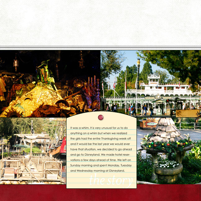
Journaling: It was a whim. It is very unusual for us to do
anything on a whim but when we realized the girls had the entire Thanksgiving week off and it would be the last year we would ever have that situation, we decided to go ahead and go to Disneyland. We made hotel reservations a few days ahead of time. We left on Sunday morning and spent Monday, Tuesday and Wednesday morning at Disneyland.

Michelle Martin: Sayge paper (white), Jesse Edwards: TitleLines 2, Pattie Knox: Brad Bonanza 3, Anna Aspnes: MonoBlendz Confiture Paperie (red), designerdigitals.com

Font: Century Gothic and Myriad Pro

Layout and concept provided by Cathy Zielske’s Design Your Life workshop at Big Picture Scrapbooking
h1

Design Your Life Week #8

Monday, December 29th, 2008

Week #8 of class continued the idea of Emphasis. The sketches for this week made a clear emphasis by having a large photograph. Here are my two examples:

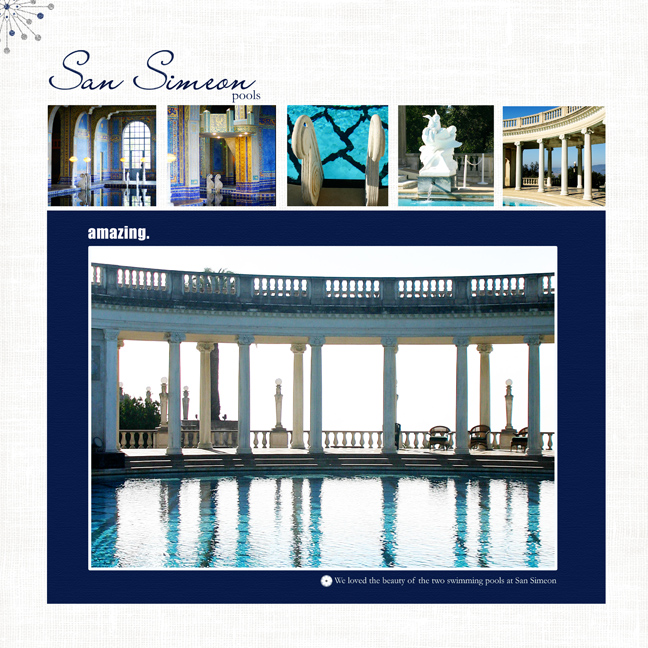
dsspoolsw.jpg

Journaling: We loved the beauty of the two swimming pools at San Simeon.

Pattie Knox: Brad Bonanza No. 03: Digital Fasteners
Mindy Terasawa: Winter Sparkle Glitters
Jesse Edwards: Clean and Serene Solids, By the Sea Alpha
Art Warehouse: Memories Circles No.10

Designer Digitals, http://www.designerdigitals.com

Other: Vinnie Pearce Your Heart paper

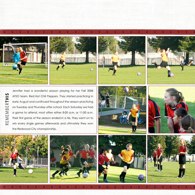
The next layout is a two-page spread.

dsoccerrhcpleftw.jpg

Journaling: Jennifer had a wonderful season playing for her Fall 2008 AYSO team, Red Hot Chili Peppers. They started practicing in early August and continued throughout the season practicing on Tuesday and Thursday after school. Each Saturday we had a game to attend, most often either 8:00 a.m. or 11:00 a.m. Their first game of the season ended in a tie. They went on to win every single games afterwards and ultimately they won the Redwood City championship.

Pattie Knox: Little Enamel Sports Accents
Ali Edwards: Remember This Title And Journal
Michelle Martin: Bergen Ribbons
Jesse Edwards: Clean and Serene Solids

Designer Digitals, http://www.designerdigitals.com

Font: Century Gothic

h1

kuler.adobe.com

Monday, December 29th, 2008

Cathy Zielske pointed our class to this website, http://kuler.adobe.com

Our challenge was to use this color generator as a way to find a good color combo for our layout using her sketch. I did one layout by finding this color combo of blue, white, cream and teal.

h1

Design Your Life Week #7

Sunday, December 28th, 2008

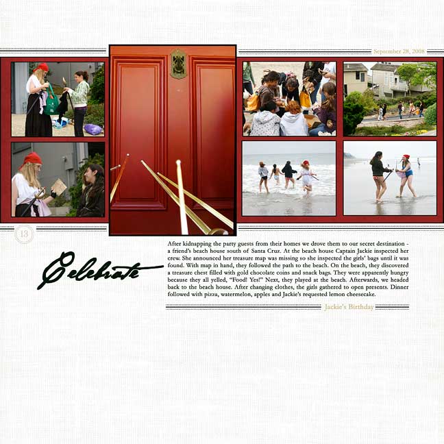
For Week #7 the class emphasized the principle of EMPHASIS. That is, making something really stand out in comparison to something else. Emphasis puts attention on something. Attention can be gained by making something big or at big in comparison to something next to it. This can be done in many ways including type size and photograph size.

My two layouts here put emphasis on a photograph because it is slightly larger than the others in the layout. Placement of the photograph makes a difference as well. Another trick is to place the title or embellishments near the photograph that is being emphasized.

d13partyw.jpg

Journaling: After kidnapping the party guests from their homes we drove them to our secret destination – a friend’s beach house south of Santa Cruz. At the beach house Captain Jackie inspected her crew. She announced her treasure map was missing so she inspected the girls’ bags until it was found. With map in hand, they followed the path to the beach. On the beach, they discovered a treasure chest filled with gold chocolate coins and snack bags. They were apparently hungry because they all yelled, “Food! Yes!” Next, they played at the beach. Afterwards, we headed back to the beach house. After changing clothes, the girls gathered to open presents. Dinner followed with pizza, watermelon, apples and Jackie’s requested lemon cheesecake.

Fonts: Garamond and Hannibal Lecter

Jessie Edwards: Title Lines 2 and Clean and Serene Solids
Ali Edwards: 31 Days Circle Numbers
Katie Pertiet: SimplyBloom paper
All Designer Digitals, http://www.designerdigitals.com

h1

Back on Track

Sunday, December 28th, 2008

Thanksgiving, Christmas, family visits and vacation have all been wonderful this last month, but I’m ready to go back to “regular” life.

Back on track with my Cathy Z. scrapbook class….

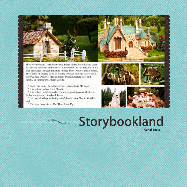
Here’s an additional layout from week 6 on unity.

dcanalboatsw.jpg

Journaling: The Storybookland Canal Boats have always been a beautiful and quiet ride among the hustle and bustle of Disneyland. On this ride, we sit in a boat that winds through miniature settings from Disney animated films. The outdoor boat ride starts by passing through Monstro’s cave. From there we pass Disney scenes landscaped with miniature trees and shrubs. The miniature settings include:

* Toad Hall from The Adventures of Ichabod and Mr. Toad
* The Sultan’s palace from Aladdin
* The village from Cinderella, featuring a gold-spired castle that is the highest point in Storybook Land.
* An English village including Alice’s house from Alice in Wonderland
* The pigs’ homes from The Three Little Pigs

Pattie Knox: Chat Freebie 06 11 08
Jessie Edwards: Title Lines and Clean and Serene Solids
Katie Pertiet: Decorative Scissors
Fonts: Myriad Pro and Garamond

All Designer Digitals, http://www.designerdigitals.com

h1

Design Your Life Week ???

Tuesday, December 2nd, 2008

Can you tell I haven’t done an update in a few weeks. Truly, I haven’t scrapped anything for this class since week #6. So, no, you haven’t missed anything. I’ve watched the videos and read the handouts (great stuff!) but I haven’t done the actual work yet. We’re on Week 9 in class. I *hope* to get to this soon…

I crossed two more things off my TO DO list!

h1

Design Your Life Week #6 Plus

Friday, November 7th, 2008

Today I have two layouts. One is from week #6 of class.

This week Cathy discussed Unity and how all the pieces we have been discussing work together to create one unified scrapbook page. She discussed Gestalt Principles and how when we first look at a page we see it (if it is designed well) as one unit, then start looking at its parts. She emphasised proximity as a way to keep a layout unified.

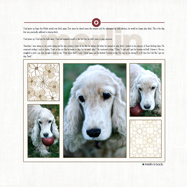
The following layout is a tribute to my dog who just turned 15 yesterday. I wrote the journaling a few weeks ago and included it here. The bottom portion of the layout is an 8 1/2 X 11 Cathy sketch for week #6 that has been flipped and placed on 12 X 12  “paper.” For the class you can see the proximity of the photos and the swatches of paper that create a unified look to the layout. Do you notice other things in this layout that have been emphasized in other weeks of the class?

Merlin is Back.

Journaling:  I had given up hope that Merlin would ever fetch again. Ever since his dental issues this summer and the subsequent lip fold infection, he would no longer play fetch. This is the dog that was practically addicted to playing fetch.

I had given up. I had put the balls away. I had just resigned myself to the fact that he didn’t want to play anymore.

Yesterday I was sitting on the porch swing and he was circling in front of me like he always did when he wanted to play fetch. I smiled at the memory of those fetching days. He continued circling. I said to Jackie, “Look at him act like he wants to play but he won’t play.” He continued circling. “Okay,” I said and I got his favorite red ball. I threw it. He ran, struggled to pick it up, then brought it back to me. “How about that?” I said. I threw again and he fetched. I smiled so big. He may be be turning 15 in 10 days but I felt like I got my dog “back.”

dmerlinisbackw.jpg

Jesse Edwards: Clean and Serene Solids, All Natural paper, Title Lines No. 2

Pattie Knox: Brad Bonanza and Coffee with Cream Alpha

Font: CK Cosmopolitan and Century Gothic

h1

Design Your Life Week #5

Monday, November 3rd, 2008

Week #5 of class considered one classic component of Cathy’s style – white space. In our chaotic world, the use of white space is a welcoming thing for the eye. The space does not need to be white (it could even be pattern paper) but it needs to be empty – empty of information that will compete with the rest of the layout.

I am a big fan of white space on layouts so I loved these sketches!

h1

Design Your Life Week #4

Friday, October 31st, 2008

Week #4 repeated the idea of repetition. Cathy applied it to making albums and mini-books and how much easier it is to do produce albums and unify them with repetition of style and elements.

We had a mini-book assignment that to be honest I just don’t feel the need to do. We were assigned two more layouts, though, and here they are:

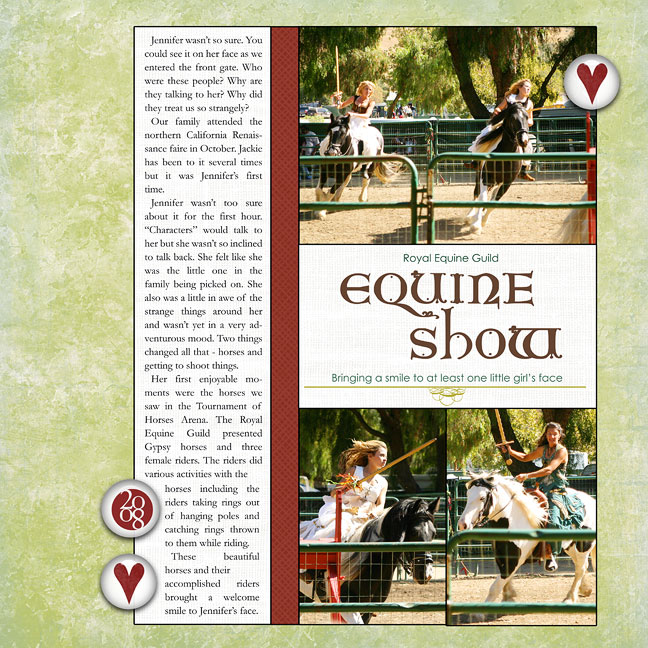
Equine Show.

Journaling:

Jennifer wasn’t so sure. You could see it on her face as we entered the front gate. Who were these people? Why are they talking to me? Why did they treat us so strangely?
Our family attended the northern California Renaissance faire in October. Jackie has been to it several times but it was Jennifer’s first time.
Jennifer wasn’t too sure about it for the first hour. “Characters” would talk to her but she wasn’t so inclined to talk back. She felt like she was the little one in the family being picked on. She also was a little in awe of the strange things around her and wasn’t yet in a very adventurous mood. Two things changed all that – horses and getting to shoot things.
Her first enjoyable moments were the horses we saw in the Tournament of Horses Arena. The Royal Equine Guild presented Gypsy horses and three female riders. The riders did various activities with the horses including the riders taking rings out of hanging poles and catching rings thrown to them while riding.
These beautiful horses and their accomplished riders brought a welcome smile to Jennifer’s face.

dequineshoww.jpg

Katie Pertiet: Soft Breeze green paper; Jouets red paper
Jesse Edwards: Clean and Serene Solids; Title Lines
Ali Edwards: Stacked Dates
Pattie Knox: Have a Heart Felt Vol. 02
All digital products: http://www.designerdigitals.com
Font: King Arthur, Century Gothic and Garamond

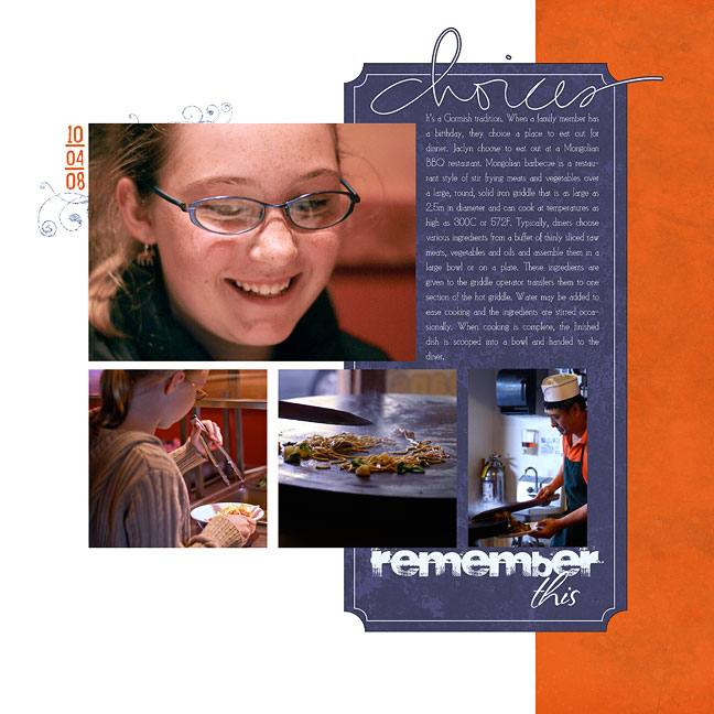
Choices.

Journaling: It’s a Gormish tradition. When a family member has a birthday, they choice a place to eat out for dinner. Jaclyn choose to eat out at a Mongolian BBQ restaurant. Mongolian barbecue is a restaurant style of stir frying meats and vegetables over a large, round, solid iron griddle that is as large as 2.5m in diameter and can cook at temperatures as high as 300C or 572F. Typically, diners choose various ingredients from a buffet of thinly sliced raw meats, vegetables and oils and assemble them in a large bowl or on a plate. These ingredients are given to the griddle operator transfers them to one section of the hot griddle. Water may be added to ease cooking and the ingredients are stirred occasionally. When cooking is complete, the finished dish is scooped into a bowl and handed to the diner.

dchoicesw.jpg

Katie Pertiet: Simply Bloom paper (orange), My Country paper (blue) and Alandia Paix Glittery
Kellie Mize: Double Dates No. 1
Ali Edwards: Growing Up Hand-Drawn Brushes
All digital products: http://www.designerdigitals.com
Font: CK Cosmopolitan

Layout and concept provided by Cathy Zielske’s Design Your Life workshop at BigPictureScrapbooking.com

h1

MA/NH/VT Trip Part 2

Thursday, October 30th, 2008

I have been forgetting to post these. Here are the last of the digital layouts from our June vacation! All supplies from Designer Digitals unless noted.

  • Quack

dquackw.jpg

Katie Pertiet: Traveler Brushes-n-Stamps
Jesse Edwards: Clean and Serene Solids
Mindy Terasawa: Flutter Butter Kit (Paper, ribbon, rub-on)
Ali Edwards: Travel Memory Title + Journal Photo Overlays
Pattie Knox: Brad Bonanza – Digital Fasteners
Kellie Mize: Tortuga Template No. 11
Font: Garamond

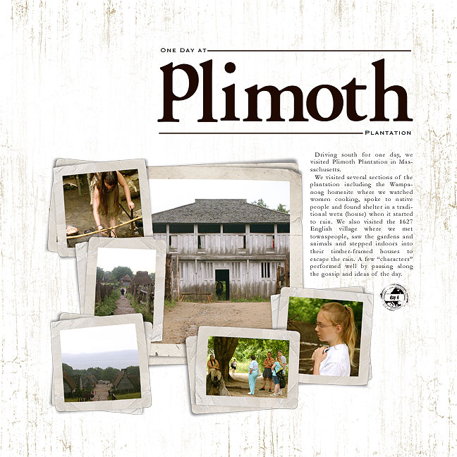
  • Plimoth

Journaling: Driving south for one day, we visited Plimoth Plantation in Massachusetts. We visited several sections of the plantation including the Wampanoag homesite where we watched women cooking, spoke to native people and found shelter in a traditional wetu (house) when it started to rain. We also visited the 1627 English village where we met townspeople, saw the gardens and animals and stepped indoors into their timber-framed houses to escape the rain. A few “characters” performed well by passing along the gossip and ideas of the day.

dplimothw.jpg

Katie Pertiet: White Cabana paper
Katie Pertiet: Traveler Stamps
Katie Pertiet: Stacked PhotoClusters No.2 (altered)
Katie Pertiet: Basic Bare Chipboard Alpha (colored)
Fonts: Copperplate and Garamond

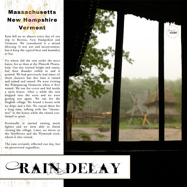
  • Rain Delay

Journaling: Rain fell on us almost every day of our trip to Boston, New Hampshire and Vermont. We considered it a mixed blessing. It was wet and inconvenient, but it keep the typical heat and humidity at bay.

No where did the rain strike the most havoc for us than at the Plimoth Plantation. Our day started bright and sunny, but then thunder rolled in and it poured. We had previously had times of short showers but this time it rained and rained and rained. We were visiting the Wampanoag Homesite when it first rained. We ran for cover and hid inside a wetu house. After a while the rain dripped into the wetu and we were getting wet again. We ran for the English village. We found a house with no drips and a fire. We stayed there for a long time, talking with the “characters” in the house while the rained continued to pour.

Eventually it started raining much lighter and we were able to finish visiting the village. Later, we drove to the Mayflower and the Plymouth rock, where it also rained.

The rain certainly affected our day, but we persevered regardless.

draindelayw.jpg

Katie Pertiet: Cabana white paper
Ali Edwards: The Story Word Art + Hand-Drawn Brushes
Lynn Grieveson: Breezy Flowers
Font: Naked God, Garamond, Arial Black

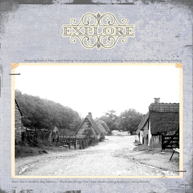
  • Plimoth 2

Journaling: Stepping back in time, experiencing life as people once lived it, learning about history and culture, feeling blessed that I live in modern day America – these are things that I love about visiting historical reenactments.

dplimoth2w.jpg

Katie Pertiet: Vintage Frames Large
Katie Pertiet: Hanging Tag Staple
Katie Pertiet: Embraced Sentiments
Jesse Edwards: Indigo Solids
Jesse Edwards: Fabric Overlays
Anna Aspnes:12X12 Distressed Edge Overlays No.3 (recolored)

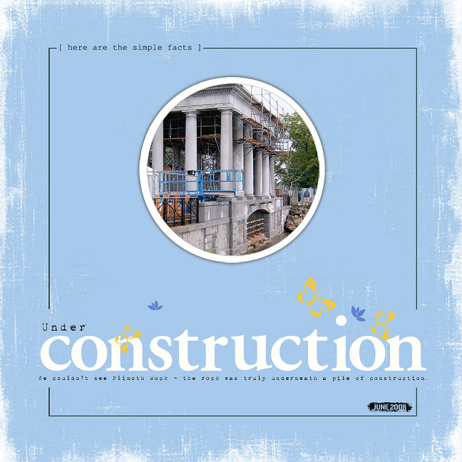
  • Under Construction

Journaling: We couldn’t see Plimoth Rock – the rock was truly underneath a pile of construction.

dunderconstructionw.jpg

Katie Pertiet: Hydrangea Solid Blue
Katie Pertiet: Drop Shadow Styles
Katie Pertiet: Grunge Overlays No. 3
Katie Pertiet: Basic Bare Chipboard Alpha
Katie Pertiet: Ad Challenge 5/11/08
Kellie Mize: Double Dates No. 1
Ali Edwards: The Story Word Art
Ali Edwards: Layered Template No. 2 (circle)
Font: 1942 Report

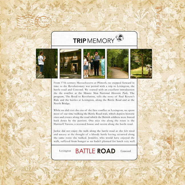
  • Battle Road

Journaling: From 17th century Massachusetts at Plimoth, we stepped forward in time to the Revolutionary war period with a trip to Lexington, the battle road and Concord. We started with an excellent introduction the the conflict at the Minute Man National Historic Park. The program, The Road to Revolution, tells the story of Paul Revere’s Ride and the battles at Lexington, along the Battle Road and at the North Bridge.

While we did visit the site of the first conflict at Lexington, we spent most of our time walking the Battle Road trail, which depicts historic sites and events along the road which the British soldiers were forced back down by the patriots. One nice site along the route is the Hartwell Tavern, a restored house and tavern along the battle road.

Jackie did not enjoy the walk along the battle road as she felt tired and uneasy at the thought of a bloody battle having occurred along the same route she walked. Jennifer, who would have enjoyed the walk, suffered from hunger as we hadn’t planned for lunch very well.

dbattleroadw.jpg

Katie Pertiet: From My Porch paper
Katie Pertiet: Traveler Stamps
Jesse Edwards: Clean and Serene Solids
Ali Edwards: Road Trip Memory Title And Journal
Font: Garamond and Century Gothic

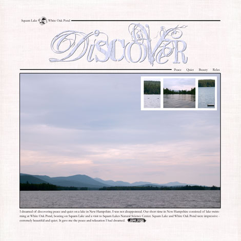
  • New Hampshire Lakes

Journaling: I dreamed of discovering peace and quiet on a lake in New Hampshire. I was not disappointed. Our short time in New Hampshire consisted of lake swimming at White Oak Pond, boating on Squam Lake and a visit to Squam Lakes Natural Science Center. Squam Lake and White Oak Pond were impressive – extremely beautiful and quiet. It gave me the peace and relaxation I had dreamed.

dnhlakesw.jpg

Jesse Edwards: Clean and Serene Solids
Katie Pertiet: Frame, Traveler Stamps, 2nd Hand Titles
Kellie Mize: Double Date No. 1
Fonts: Garamond

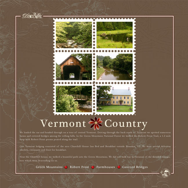
  • Vermont Country

Journaling: We loaded the car and headed through on a tour of central Vermont. Driving through the back roads of Vermont we spotted numerous farms and covered bridges among the rolling hills. In the Green Mountains National Forest we walked the Robert Frost Trail, a 1.2 mile loop with Robert Frost poems posted along the trail. Our Vermont lodging consisted of the nice Churchill House Inn Bed and Breakfast outside Brandon, VT. We were served delicious omelets, croissants and fruit for breakfast. Near the Churchill house, we walked a beautiful path into the Green Mountains. We did not walk too far because of the dreaded mosquitoes which were descending on us.

dvermontcountryw.jpg

Katie Pertiet: Fresh Botanicals No.2
Katie Pertiet: 2nd Hand Titles
Katie Pertiet: Traveler Stamps
Katie Pertiet: Postage Frames No.2
Pattie Knox: Brad Bonanza – Digital Fasteners
Lynn Grieveson: Breezy Flowers
Fonts: Plantagenet Cherokee and Garamond

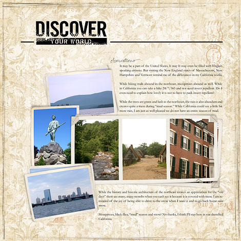
  • New England

Journaling: While the history and historic architecture of the northeast creates an appreciation for the “old days” there are many, many months when you can’t see it because it is covered with snow. I am reminded of the joy of being able to drive to the snow when I want it and to go back home sans snow.

Mosquitoes, black flies, “mud” season and snow? No thanks, I think I’ll stay here in sun drenched California.

It may be a part of the United States. It may It may even be filled with English speaking citizens. But visiting the New England states of Massachusetts, New Hampshire and Vermont remind me of the differences in my California world.

While hiking trails abound in the northeast, mosquitoes abound as well. While in California you can take a hike 24/7/365 and not need insect repellent. Do I even need to explain how lovely it is not to have to pack insect repellent?

While the trees are green and lush in the northeast, the rain is also abundant and creates quite a mess during “mud season.” While California could use a little bit more rain, I am just as well pleased we do not have an entire season of mud.

dnewenglandw.jpg

Katie Pertiet: From My Porch paper, Stacked PhotoClusters No.2 and Strong Words Brushes and Stamps
Ali Edwards:
The Story Word Art + Hand-Drawn Brushes
Fonts: Garamond