Design Your Life Week #8
December 29th, 2008Week #8 of class continued the idea of Emphasis. The sketches for this week made a clear emphasis by having a large photograph. Here are my two examples:
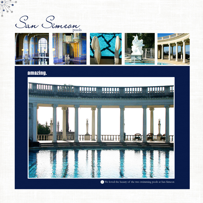
Journaling: We loved the beauty of the two swimming pools at San Simeon.
Pattie Knox: Brad Bonanza No. 03: Digital Fasteners
Mindy Terasawa: Winter Sparkle Glitters
Jesse Edwards: Clean and Serene Solids, By the Sea Alpha
Art Warehouse: Memories Circles No.10
Designer Digitals, http://www.designerdigitals.com
Other: Vinnie Pearce Your Heart paper
The next layout is a two-page spread.
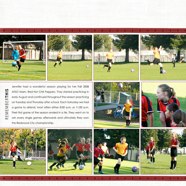
Journaling: Jennifer had a wonderful season playing for her Fall 2008 AYSO team, Red Hot Chili Peppers. They started practicing in early August and continued throughout the season practicing on Tuesday and Thursday after school. Each Saturday we had a game to attend, most often either 8:00 a.m. or 11:00 a.m. Their first game of the season ended in a tie. They went on to win every single games afterwards and ultimately they won the Redwood City championship.
Pattie Knox: Little Enamel Sports Accents
Ali Edwards: Remember This Title And Journal
Michelle Martin: Bergen Ribbons
Jesse Edwards: Clean and Serene Solids
Designer Digitals, http://www.designerdigitals.com
Font: Century Gothic


Such beautiful photography Denise! You did a great job on these two layouts. reen
Your layouts are perfection!
I love them, and the large photo of Jennifer looks like it could be a magazine cover.
Beautiful work.
Have a wonderful New Year’s!
Gorgeous, gorgeous pages, Denise!!!!
oh my! I havent been by your blog in awhile denise. Your layouts are gorgeous!!!!
They are awesome Denise!
Happy New year!
My goal this year to go digital for layouts!! woohoo!!!
I really want to go 8 1/2 x 11 I think though….hmmmm…
You are certainly creating some fantastic designs Denise. Both of those layouts are amazing!!! Love how that Blue enhances that top layout. The white against the blue just makes those photos pop. And that layout of Jennifer??? wowza! You are on a roll!